How Virgin Atlantic designed a feel-good airport experience
20 July 2021

What’s in a name? When it comes to building your brand and making your mark, the question is often paired with: ‘what’s in a typeface?’
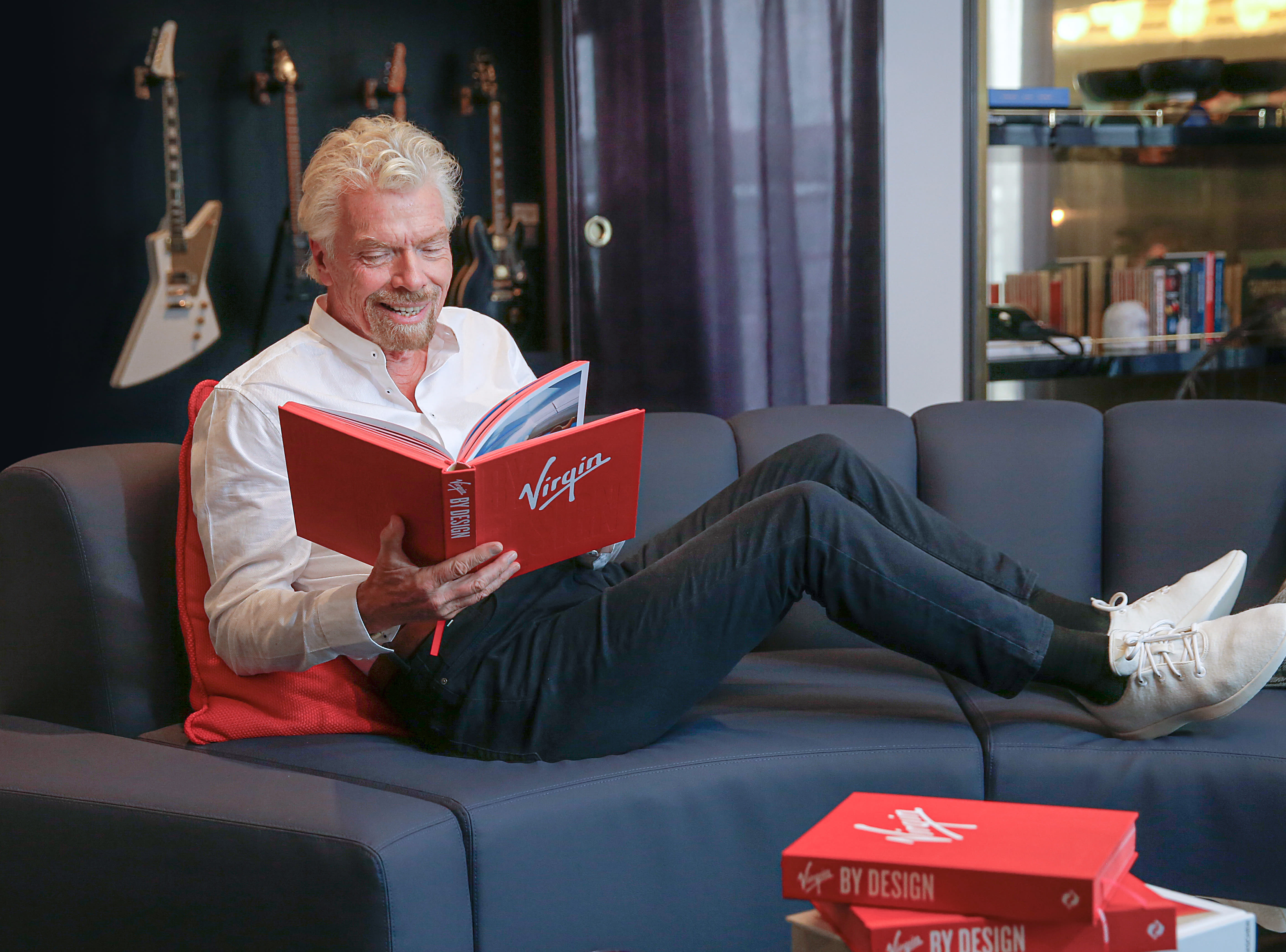
Virgin By Design is a book which celebrates 50 years of Virgin’s history, and takes a closer look at how Virgin’s logo has stood the test of time.
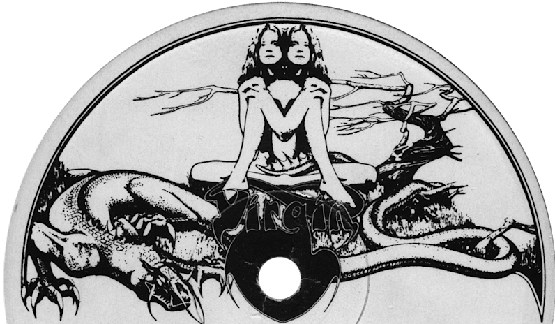
The brand’s original logo was designed by Roger Dean in 1970. Roger was actually a furniture designer when Richard asked him to design Virgin Records very first logo. Roger went on to leave an important impact on the British record industry, and is credited for establishing the profession of ‘sleeve designer’.
Roger’s design featured naked Siamese twins sitting next to a twisted tree with a crouching dragon at their feet. It bore all the hallmarks of a psychedelic rock album, and perfectly illustrated the record label’s counter-culture spirit. However, when Virgin Records signed the Sex Pistols in 1977, the team decided that an edgier and more versatile logo would better suit. On a technical level, the design also lacked the requirements of a logo fit for a modern and expanding business - legibility, scalability and versatility. It’s difficult to imagine the prowling, red dragon painted across an aircraft or a bank on the high street!
When the Sex Pistols signed, the team asked an agency called Cooke Key to design a logo that illustrated the label’s punk personality, but would also be dynamic and endurable. The agency collaborated with a young calligrapher who designed the scrawled script that defines the brand to this day… And legend has it he did it on the back of a napkin.
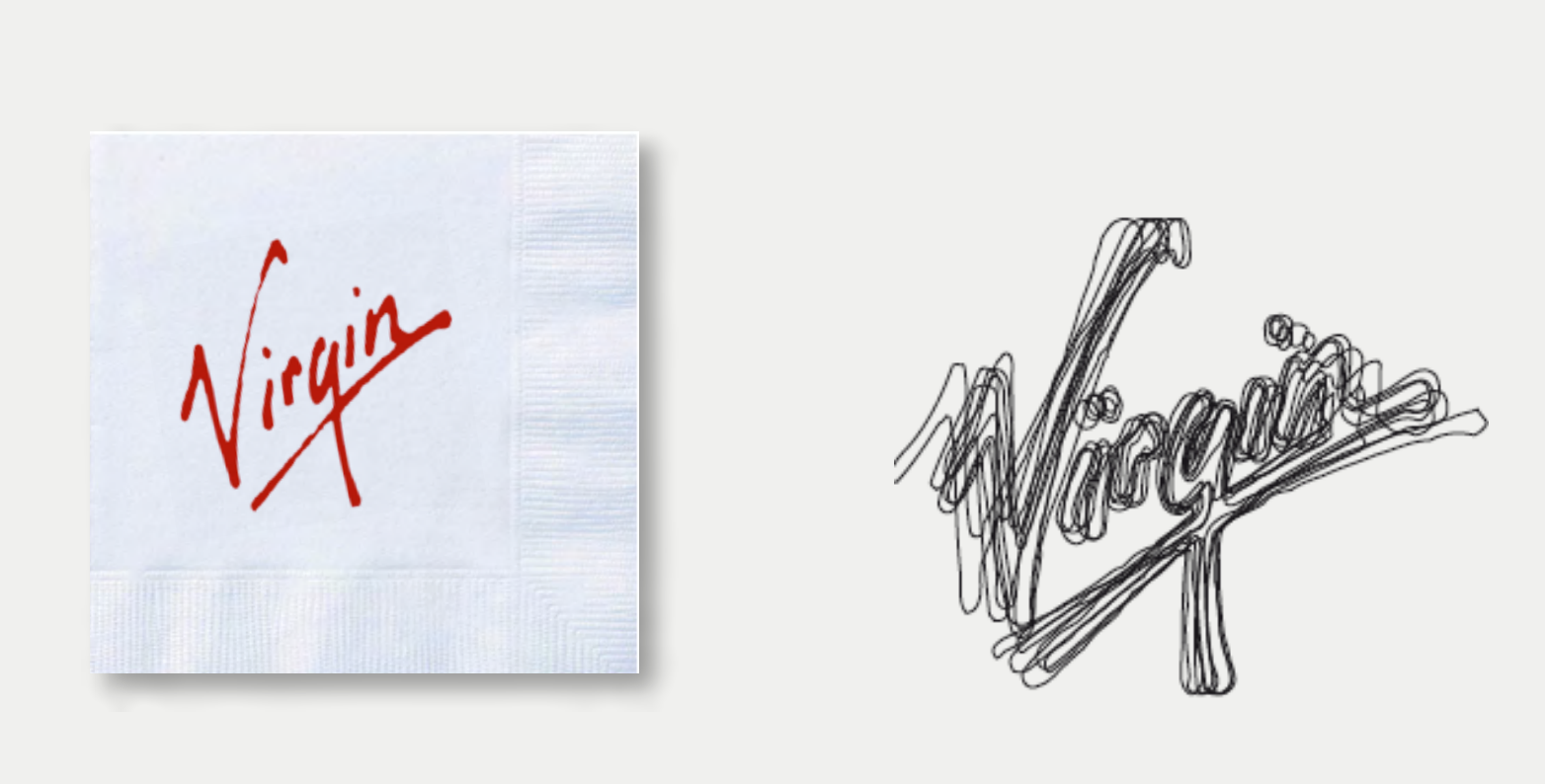
In the following decades – as Virgin established itself as a globally recognised brand across multiple sectors including travel, banking, health and fitness, communications, and entertainment – the script endured and continues to reflect Virgin’s human, playful, and energetic brand identity.

Although Virgin now runs over 40 companies across five continents, we still don’t play by the rules. For any Virgin business, there are just three 'brand identity guardrails' that help us make (and maintain) our mark: the Virgin script, the Virgin red, and our straight-shooting, witty tone of voice. These are the elements that drive the instant recognition of the brand. Beyond this, a decent amount of creative license lets our companies form their own take on the Virgin identity and explore their own ideas, that are specific to their sector.
As Fiona Ross, Virgin Group’s Director of Brand & Creative Capabilities puts it:
“The Virgin brand is 10 per cent rules, and 90 per cent creative freedom.”
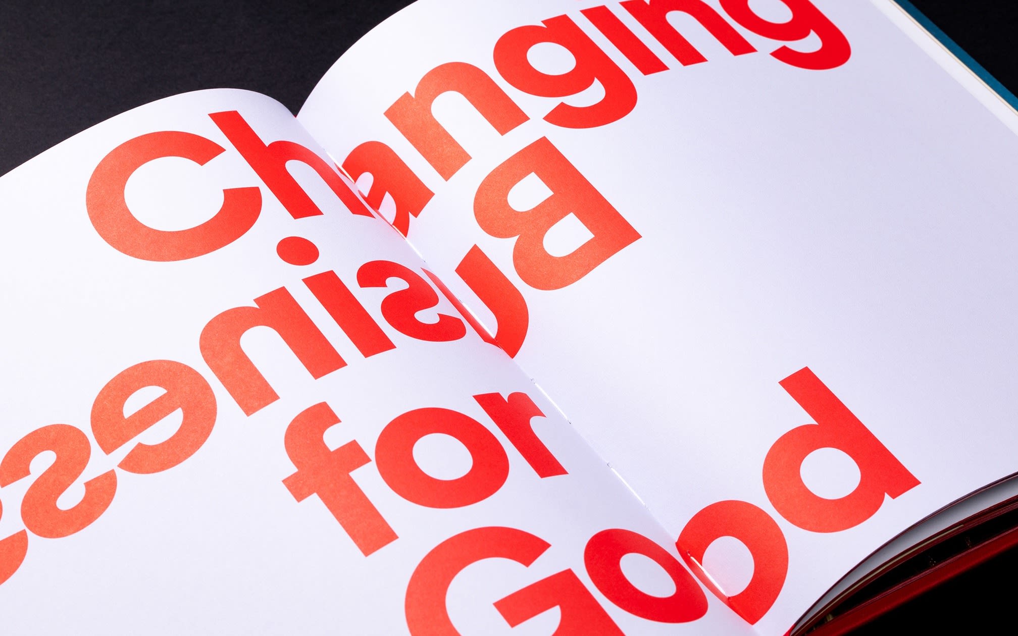
We also work to ensure that Virgin’s iconic brand identity remains fit for purpose in an ever-shifting landscape. The latest revision of our brand identity unlocks the magic of the Virgin brand, while carefully reflecting our values, and our purpose of changing business for good. As a brand that puts people first, we focus on design that is inclusive, accessible and welcoming to all. We also have a sharp focus on design that is as sustainable as it is exceptional.
When it comes to making your mark and building a well-loved brand, a strict set of brand guidelines and an in-vogue logo won’t get you far. A brand is built by its people, its culture and the experiences it creates… To build that into your logo is no mean feat, but one that is worth the investment.